Chapter 3 Sample Statistics
In the previous two units, we studied populations and how to summarize them with statistics when the entire population was measured. In other words, the measure of center (mean) and measure of spread (standard deviation) were the summary of all observations.
In the case of a yield monitor map, these are appropriate statistics. In most every other agricultural reality, however, we cannot measure every individual in a population. Instead, we only have enough resources to collect a sample the population, that is, measure a subset of individuals from the population. In this case, we cannot measure the exact population mean or population standard deviation of the population. Instead, we can only estimate them using our sample mean or sample standard deviation.
This, of course, raises questions. Was the sample representative of the population? Would another random sample result in a similar estimate of the population mean or population standard deviation? And, perhaps, how much could our sample mean deviate from the population mean?
In other words, there is always uncertainty that statistics calculated from samples represent the true values of a population. You might even say we lack complete confidence that a sample mean will closely estimate the population mean.
Enter statistics. By taking multiple sets of samples, and calculating their means, we can use the differences among those sample means to estimate the distribution of sample means around the true population mean. Indeed, this is a fundamental concept of research and statistics – using the measured variance of samples to determine how accurate they are in predicting population statistics.
3.1 Samples
To measure the variation of sample means, we need at least two samples to compare. Ideally we can gather even more. As we will see, the more samples included in our estimates of the population mean, the more accurate we are likely to be.
A second comment, which may seem intuitive, but at the retail level may be overlooked, is randomization. Samples – for example individual plants or areas where yield will be measured – are ideally selected at random. In reality, the plants or areas selected for measures may be less than random. When I used to count weed populations, we used square quadrats (frames) to consistently define the area that was measured. We would throw them into different areas of the plot and count weeds where ever they landed.
The most important thing about selecting samples, however, is that the researcher work to minimize bias. Bias is when the samples selected consistently overestimate or underestimate the population mean. The most egregious example of this would be a researcher who consistently and purposely sampled the highest- or lowest-measuring parts of a field.
But bias can enter in other ways. For example, if our weed populations were very uneven, our thrown quadrat might be more likely to skid to a stop in weedy areas. A researcher might unconsciously choose taller plants to sample. In August, we might be tempted to sample a corn field from the edge than walk deep into that sweltering, allergenic hell.
Remember, our goal is to generate estimates of population values that are as precise and accurate as our resources allow. Precise means our sample means have a low variance around the population mean. Accurate means our sample means are equivalently scattered above and below the population mean.
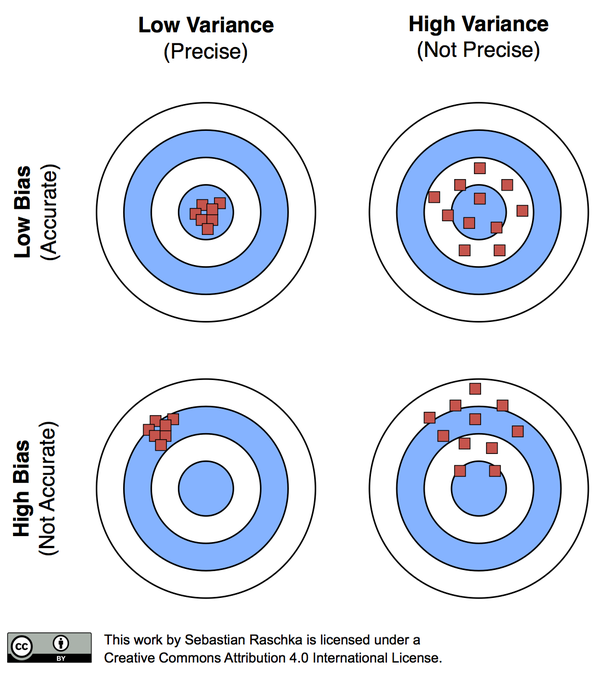
Accuracy versus Bias
3.2 Case Study
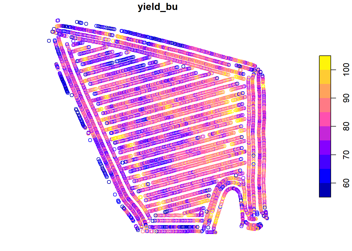
Once more, we will work with the Iowa soybean yield dataset from Units 1 and 2.
Let’s review the structure of this dataset:
## Simple feature collection with 6 features and 12 fields
## Geometry type: POINT
## Dimension:     XY
## Bounding box:  xmin: -93.15033 ymin: 41.66641 xmax: -93.15026 ymax: 41.66644
## Geodetic CRS:  WGS 84
##    DISTANCE SWATHWIDTH VRYIELDVOL Crop  WetMass Moisture                 Time
## 1 0.9202733          5   57.38461  174 3443.652     0.00 9/19/2016 4:45:46 PM
## 2 2.6919269          5   55.88097  174 3353.411     0.00 9/19/2016 4:45:48 PM
## 3 2.6263101          5   80.83788  174 4851.075     0.00 9/19/2016 4:45:49 PM
## 4 2.7575437          5   71.76773  174 4306.777     6.22 9/19/2016 4:45:51 PM
## 5 2.3966513          5   91.03274  174 5462.851    12.22 9/19/2016 4:45:54 PM
## 6 3.1840529          5   65.59037  174 3951.056    13.33 9/19/2016 4:45:55 PM
##    Heading VARIETY Elevation                  IsoTime yield_bu
## 1 300.1584   23A42  786.8470 2016-09-19T16:45:46.001Z 65.97034
## 2 303.6084   23A42  786.6140 2016-09-19T16:45:48.004Z 64.24158
## 3 304.3084   23A42  786.1416 2016-09-19T16:45:49.007Z 92.93246
## 4 306.2084   23A42  785.7381 2016-09-19T16:45:51.002Z 77.37348
## 5 309.2284   23A42  785.5937 2016-09-19T16:45:54.002Z 91.86380
## 6 309.7584   23A42  785.7512 2016-09-19T16:45:55.005Z 65.60115
##                     geometry
## 1 POINT (-93.15026 41.66641)
## 2 POINT (-93.15028 41.66641)
## 3 POINT (-93.15028 41.66642)
## 4  POINT (-93.1503 41.66642)
## 5 POINT (-93.15032 41.66644)
## 6 POINT (-93.15033 41.66644)
And map the field:
In Unit 2, we learned to describe these data using the normal distribution model. We learned the area under the normal distribution curve corresponds to the proportion of individuals within a certain range of values. We also discussed how this proportion allows inferences about probability. For example, the area under the curve that corresponded with yields from 70.0 to 79.9 represented the proportion of individuals in the yield population that fell within that yield range. But it also represented the probability that, were you to measure individual points from the map at random, you would measure a yield between 70.0 and 79.9.
3.3 Distribution of Sample Means
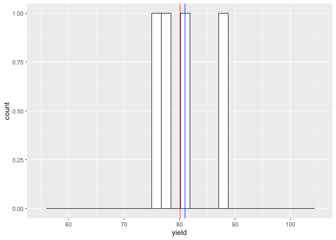
In the last unit, we sampled the yield from 1000 locations in the field and counted the number of observations that were equal to or greater than 70 and equal to or less than 80.
What would happen if we only sampled from one location. What would be our sample mean and how close would it be to the population mean?
In the histograms below, the red vertical line marks the population mean. The blue line marks the sample mean.
set.seed(1771)
yield_sample = sample(yield$yield_bu, 1) %>%
      as.data.frame()
names(yield_sample) = c("yield")
ggplot(yield_sample, aes(x=yield)) +
  geom_histogram(fill="white", color="black") +
  geom_vline(xintercept = mean(yield$yield_bu), color = "red") +
  geom_vline(xintercept = mean(yield_sample$yield), color = "blue") +
  lims(x=c(55,105))
## `stat_bin()` using `bins = 30`. Pick better value with `binwidth`.## Warning: Removed 2 rows containing missing values (geom_bar).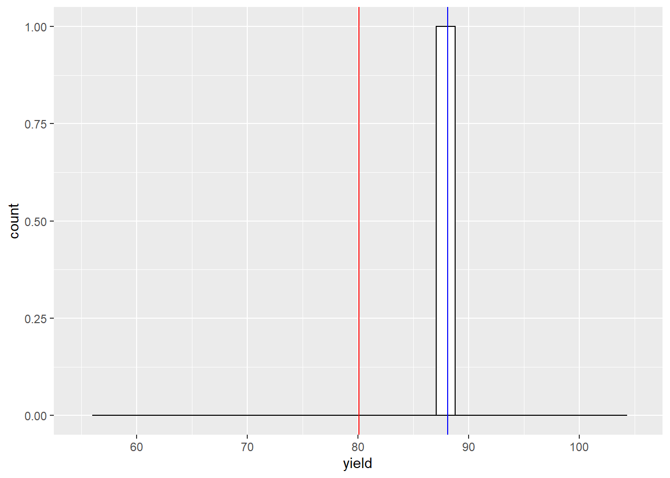
With one sample, our sample mean is about 8 bushels above the population mean. What would happen if we sampled twice?
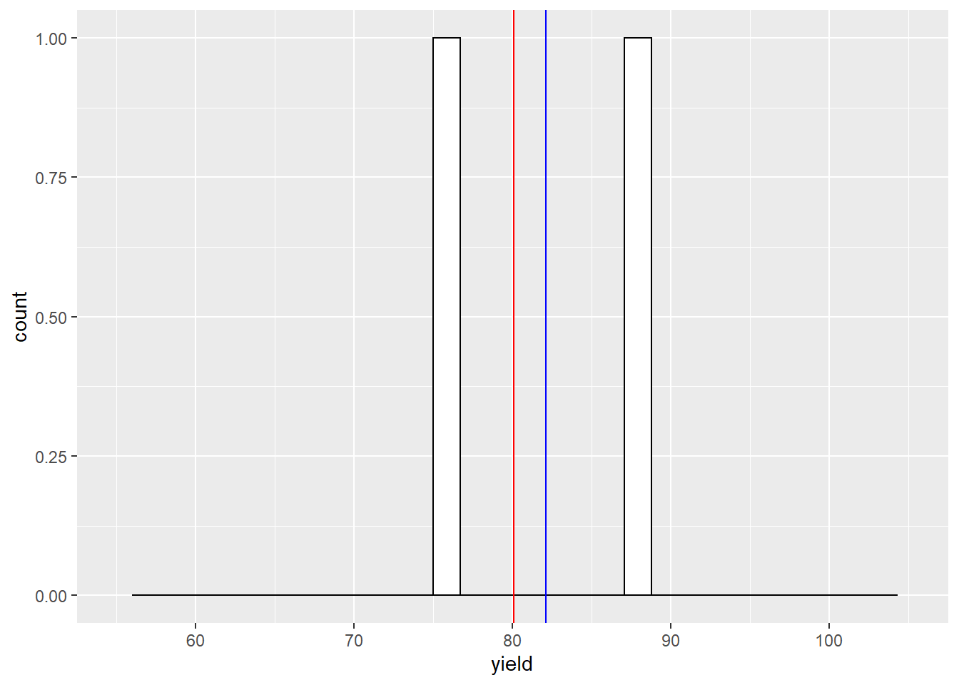
Our sample mean is now about 2 bushels greater than the population mean. What would happen if we sampled four times?
Our sample mean is now about 1 bushel greater than the population mean. What would happen if we sampled 15 times?
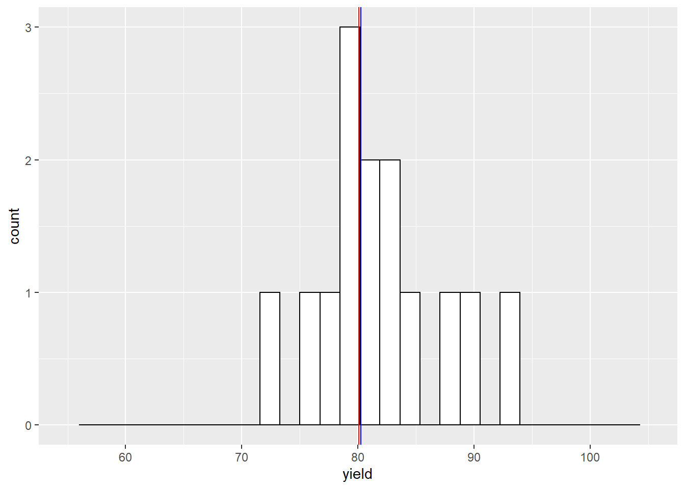
The sample mean and population mean are almost equal.
Click on this link to access an app to help you further understand this concept:
https://marin-harbur.shinyapps.io/03-sampling_from_normal_distn/
3.4 Central Limit Theorem
The Central Limit Theorem states that sample means are normally distributed around the population mean. This concept is powerful because it allows us to calculate the probability that that a sample mean is a given distance away from the population mean. In our yield data, for example, the Central Limit Theorem allows us to assign a probability that we would observe a sample mean of 75 bushels/acre, if the population mean is 80 bushels/acre. More on how we calculate this in a little bit.
In our yield dataset, the population data are approximately normally distributed. It makes sense that the sample means would be normally distributed, too. But the Central Limit Theorem shows us that our sample means are likely to be normally distributed even if the population does not follow a perfect normal distribution.
Let’s take this concept to the extreme. Suppose we had a population where every value occurred with the same frequency. This is known as a uniform distribution. Click on the following link to visit an app where we can explore how the sample distribution changes in response to sampling an uniform distribution:
https://marin-harbur.shinyapps.io/03-sampling-from-uniform-distn/
You will discover that the sample means are normally distributed around the population mean even when the population itself is not normally distributed.
3.5 Standard Error
When we describe the spread of a normally-distributed population – that is, all of the individuals about which we want to make inferences – we use the population mean and standard deviation.
When we sample (measure subsets) of a population, we again use two statistics. The sample mean describes the center of the samples.. The spread of the sample means is described by the standard error of the mean (often abbreviated to standard error). The standard error is related to the standard deviation as follows:
\[SE = \frac{\sigma}{\sqrt n} \]
The standard error, SE, is equal to the standard deviation (\(\sigma\)), divided by the square root of the number of samples (\(n\)). This denominator is very important – it means that our standard error grows as the number of samples increases. Why is this important?
A sample mean is an estimate of the true population mean. The distribution of sample means the range of possible values for the population mean. I realize this is a fuzzy concept. This is the key point: by measuring the distribution of our sample sample means, we are able to describe the probability that the population mean is a given value.
To better understand this, please visit this link:
https://marin-harbur.shinyapps.io/03-sample-distn/
If you take away nothing else from this lesson, understand whether you collect 2 or 3 samples has tremendous implications for your estimate of the population mean. 4 samples is much better than 3. Do everything you can to fight for those first few samples. Collect as many as you can afford, especially if you are below 10 samples.
3.6 Degrees of Freedom
In Unit 1, the section on variance briefly introduced degrees of freedom, the number of observations in a population or sample, minus 1. Degrees of Freedom are again used below in calculating the t-distribution. So what are they and why do we use them? Turns out there are two explanations.
In the first explanation, degrees of freedom refers to the number of individuals or samples that can vary independently given a fixed mean. So for an individual data point to be free, it must be able to assume any value within a given distribution. Since the population mean is a fixed number, only \(n-1\) of the data have the freedom to vary. The last data point is determined by the value of all the other data points and the population mean.
Confusing, huh? Who starts measuring samples thinking that the data point is fixed, in any case? But if you think about it, the purpose of the sample is approximate a real population mean out there – which is indeed fixed. It’s just waiting for us to figure it out. So if our sample mean is equal to the population mean (which we generally assume), then the sample mean is also fixed. But it is a very weird way of thinking.
Yet this is the answer beloved by all the textbooks, so there you go.
The second answer I like better: samples normally underestimate the true population variance. This is because the sample variance is calculated from the distribution of the data around the sample mean. Sample data will always be closer to the sample mean – which is by definition based on the data themselves – then the population mean.
Think about this a minute. Your sample data could be crazy high or low compared to the overall population. But that dataset will define a mean, and the variance of the population will be estimated from that mean. In many cases, it turns out that using \(n-1\) degrees of freedom will increase the value of the sample variance so it is closer to the population variance.
3.7 The t-Distribution
In the last unit, we used the Z-distribution to calculate the probability of observing an individual of a given value in a population, given its population mean and standard deviation. Recall that about 68% of individuals were expected to have values within one standard deviation, or Z, of the population mean. Approximately 95% of individuals were expected to have values within 1.96 standard deviations of the population mean. Alternatively, we can ask what the probability is of observing individuals of a particular or greater value in the population, given its mean and standard deviation.
We can ask a similar question of our sample data: what is the probability the population mean is a given value or greater, given the sample mean? As with the Z-distribution, the distance between the sample mean and hypothesized population mean will determine this probability.
There is one problem, however, with using the Z-distribution: it is only applicable when the population standard deviation is known. When we sample from a population, we do not know it’s true standard deviation. Instead, we are estimating it from our samples. This requires we use a different distribution: the t-distribution.
Unlike the Z-distribution, the t-distribution changes in shape as the number of samples increases. Notice in the animation above that, when the number of samples is low, the distribution is wider and has a shorter peak. As the number of samples increases, the curve becomes narrower and taller. This has implications for the relationship between the distance of a hypothetical population mean from the sample mean, and the probability of it being that distant.
We can prove this to ourselves with the help of the shadeDist()
function we used in Unit 2. You will learn how to plot the
t-distribution in an exercise this week.
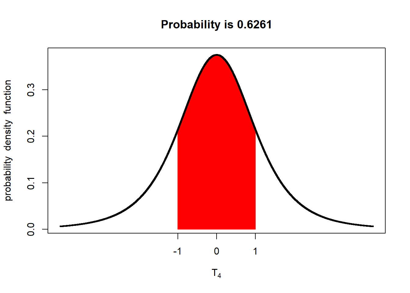
With 4 degrees of freedom, there is about a 63% probability the population mean is within 1 standard error of the mean. Let’s decrease the sample mean to 3 degrees of freedom
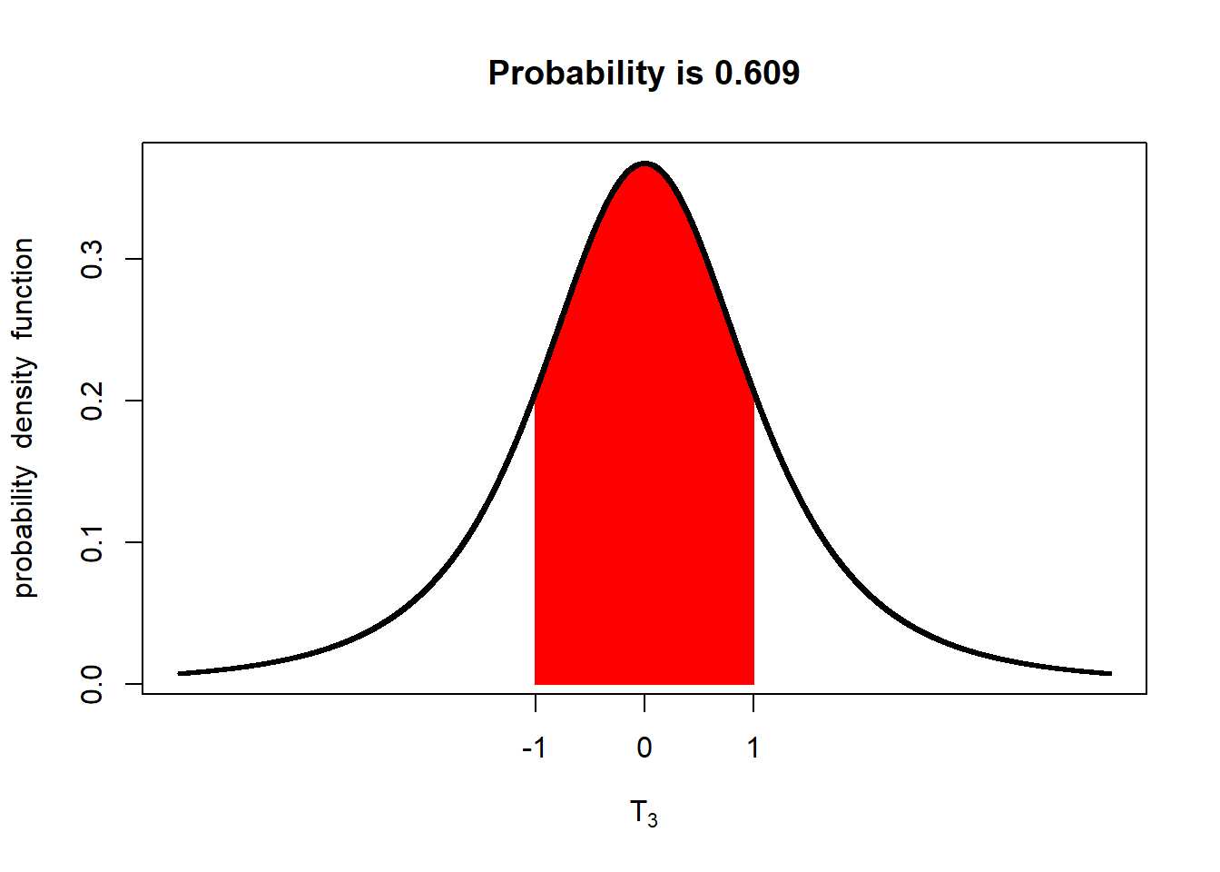
With only 3 degrees of freedom (4 samples), there is only a 61% probability the population mean is within one standard error of the mean. What if we only had one degree of freedom (two samples)?
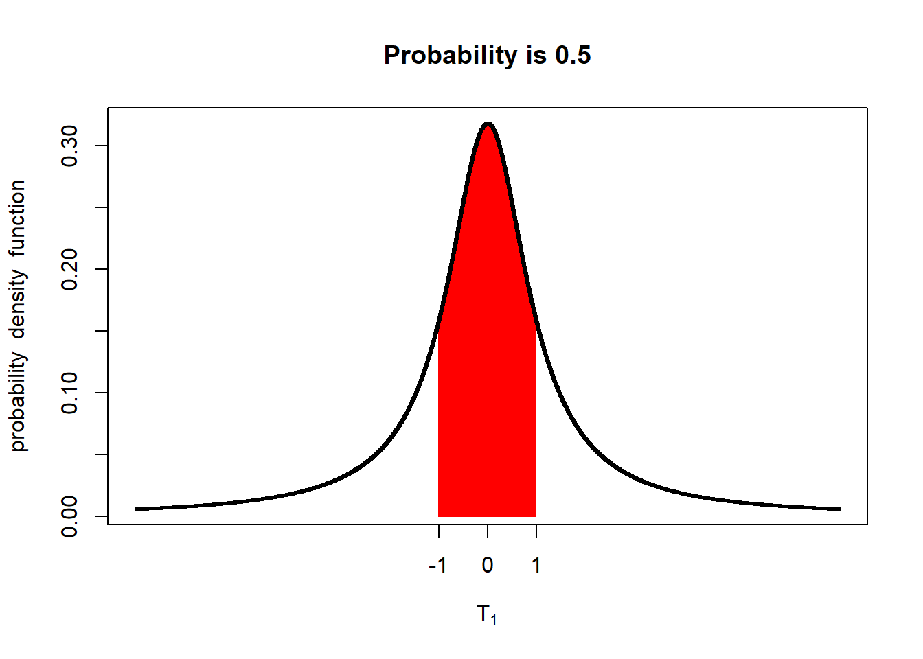
You should see the probability that the population mean is within 1 standard error of the sample mean falls to 50%.
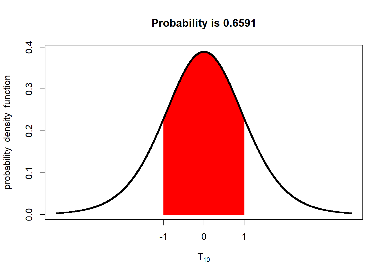
If we have 10 degrees of freedom (11 samples), the probability increases to about 66%.
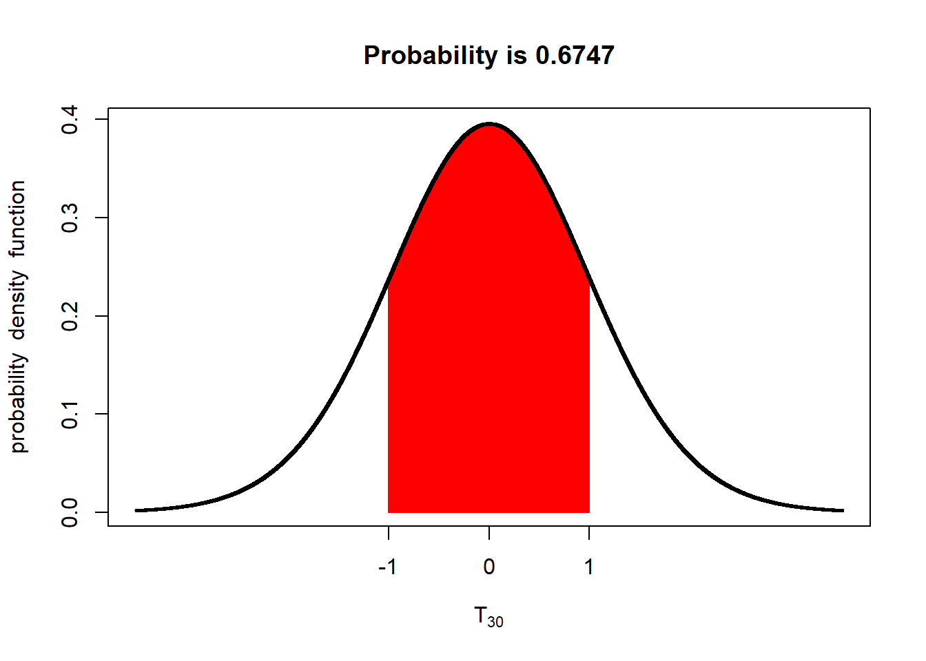
With 30 degress of freedom the probability the population mean is within 1 standard error of the sample mean increases to 67%.
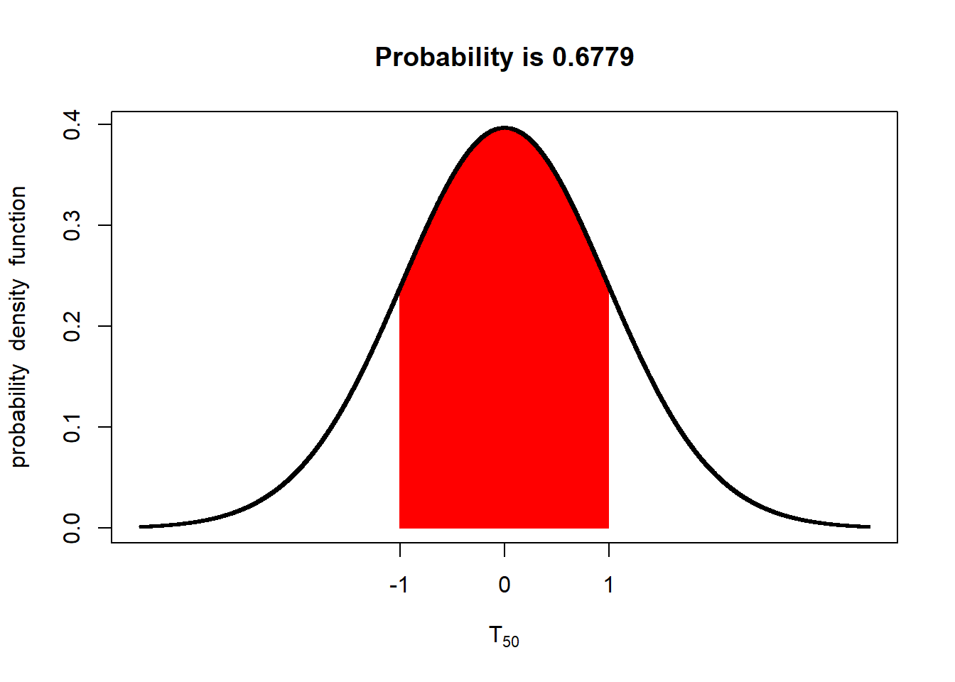
With 50 degrees of freedom (51 samples) the probability is about 68%. At this point, the t-distribution curve approximates the shape of the z-distribution curve.
We can sum up the relationship between the t-value and probability with this plot. The probability of the population mean being within one standard error of the population mean is represented by by the red line. The probability of of the population mean being within 2 standard errors of the mean is represented by the blue line. As you can see, the probability of the population mean being within 1 or 2 standard errors of the sample mean increases with the degrees of freedom (df). Exact values can be examined by tracing the curves with your mouse.
Conversely, the t-value associated with a given proportion or probability will also decrease as the degrees of freedom increase. The read line represents the t-values that define the area with a 68% chance of including the population mean. The blue line represents the t-values that define the area with a 95% chance of including the population mean. Exact values can be examined by tracing the curves with your mouse. Notice the t-value associated with a 68% chance of including the population mean approaches 1, while the t-value associated with a 95% chance approaches about 1.98.
Takeaway: the number of samples affects not only the standard error, but the t-distribution curve we use to solve for the probability that a value will occur, given our sample mean.
3.8 Confidence Interval
The importance of the number of samples the standard error, and the t-distribution becomes even more apparent with the use of confidence interval. A confidence interval is a range of values around the sample mean that are selected to have a given probability of including the true population mean. Suppose we want to define, based on a sample size of 4 from the soybean field above, a range of values around our sample mean that has a 95% probability of including the true sample mean.
The 95% confidence interval is equal to the sample mean, plus and minus the product of the standard error and t-value associated with 0.975 in each tail:
\[CI = \bar x + t \times se\]
Where \(CI\) is the confidence interval, \(\bar{x}\) is the sample mean, \(t\) is determined by desired level of confidence (95%) and degrees of freedom, and \(se\) is the standard error of the mean
Since the t-value associated with a given probability in each tail decreases with the degrees of freedom, the confidence interval narrows as the degrees of freedom increase – even when the standard error is unaffected.
Lets sample our yield population 4 times, using the same code we did earlier. Although I generally try to confine the coding in this course to the exercises, I want you to see how we calculate the confidence interval:
- Let’s set the seed using
set.seed(1776). When R generates what we call a random sample, it actually uses a very complex algorithm that is generally unknown to the user. The seed determines where that algorithm starts. By setting the seed, we can duplicate our random sample the next time we run our script. That way, any interpretations of our sample will not change each time it is recreated.
# setting the seed the same as before means the same 4 samples will be pulled
set.seed(1776)- Now, let’s take 4 samples from our population using the
sample()function. That function requires has arguments. First,yield$yield_butells R to sample theyield_bucolumn of theyielddata.frame. The second argment,size=4, tells R to take four samples.
# collect 4 samples
yield_sample = sample(yield$yield_bu, size=4)
#print results
yield_sample
## [1] 82.40863 71.68231 73.43349 81.27435Next, we can calculate our sample mean and sample standard deviation. We will assign these values to the objects
sample_meanandsample_sd.sample_mean = mean(yield_sample) sample_sd = sd(yield_sample) sample_mean## [1] 77.1997sample_sd## [1] 5.427144Finally, we can calculate the standard error, by dividing
sample_sdby the square root of the number of observations in the sample, 4 . We assign this value to the objectsample_se.
sample_se = sd(yield_sample)/sqrt(4)

sample_se
## [1] 2.713572At this point, we have everything we need to calculate the confidence interval except the t-value. The middle 95% of the of the population will look like this:
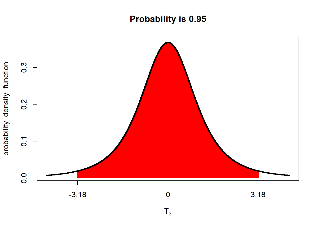
There will be about 2.5% of the distribution above this range and 2.5 below it. We can calculate the t-values that define the upper or lower boundary of the middle 95% using the
qt()function.qt()contains two arguments.p=0.975tells R we want the t-value below which 97.5% of the t-distribution occurs.df=3tells R we want the t-value associated with 3 degrees of freedom.# t-value associated with 3 df upper_t = qt(p=0.975, df=3) upper_t## [1] 3.182446Our lower limit is the t-value below which only 2.5% of the t-distribution occurs.
## [1] -3.182446You will notice that “lower_t,” the t-value that measures from the sample mean to the lower limit of the confidence interval, is just the negative of “upper_t.” Since the normal distribution is symmetrical around the mean, we can just determine the upper limit and use its negative as the lower limit of our confidence interval.
We can then calculate our upper confidence limit. The upper limit of the confidence interval is equal to:
\[ \text{Upper CL} = \bar{x} + t \cdot SE \]
Where \(\bar{x}\) is the sample mean, \(t\) is the t-value associated with the upper limit, and \(SE\) is the standard error of the mean.
upper_limit = sample_mean + upper_t*sample_se
upper_limit
## [1] 85.83549- We can repeat the process to determine the lower limit.
lower_limit = sample_mean + lower_t
lower_limit
## [1] 74.01725- Finally, we can put this all together and express it as follows. The confidence interval for the population mean, based on the sample mean is:
\[ CI = 81.6 \pm 3.2 \]
We can also express the interval by its lower and upper confidence limits. \[(78.5, 85.4)\] We can confirm this interval includes the true population mean, which is 80.1.
3.9 Confidence Interval and Probability
Lets return to the concept of 95% confidence. This means if we were to collect 100 sets of 4 samples each, 95% of them would estimate confidence intervals that include the true population mean. The remaining 5% would not.
Click on this link to better explore this concept:
https://marin-harbur.shinyapps.io/03-confidence-interval/
Again, both the standard error and the t-value we use for calculating the confidence interval decrease as the number of samples decrease, so the confidence interval itself will decrease as well.
Click on the link below to explore how the size (or range) of a confidence interval changes with the number of samples from which it is calculated:
https://marin-harbur.shinyapps.io/03-sample-size-conf-interval/
As the number of samples increases, the confidence interval shrinks. 95 out of 100 times, however, the confidence interval will still include the true population mean. In other words, as our sample size increases, our sample mean becomes less biased (far to either side of the population mean), and it’s accuracy (the proximity of the sample mean and population mean) increases. In conclusion, the greater the number of samples, the better our estimate of the population mean.
In the next unit, we will use these concepts to analyze our first experimental data: a side by side trial where we will us the confidence interval for the difference between two treatments to test whether they are different.